Lomochrome Color ’92 Film Review
Inc. Exclusive Interview With Lomography + Home Development/Scanning Tips
11 min read by Dmitri, with image(s) by Betty.Published on . Updated on .
Lomochrome Color’92 is a new colour film from Lomography, characterized by chunky grain, low contrast, and a warm colour palette that’s refreshingly unique and unexpectedly flattering.
Color’92 is the successor to Lomography’s earlier foray into new true-colour-negative films that began with Lomochrome Metropolis — the first new formula of the type in a decade. It may look similar (and maybe come from the same place) as the new ORWO colour films — but ’92 is vastly superior to all of those films when it comes to colour reproduction.
The film is relatively affordable, selling at $12.90 per 35mm/36exp. roll, $11.90 for medium format, or $8.90 in 110 as of this writing.
Note that Lomochrome Color’92 film has a box speed of ISO 400, but the 35mm film canister does not have a DX code; thus, it can not be used in point-and-shoot cameras that do not let you select your film speed (unless you’re planning to pull it).
In this review: Lomochrome Color’92 colours, and editing. Grain structure, sharpness, resolution, and dynamic range. Exposing Lomochrome Color’92. Developing and scanning Lomochrome Color’92 at home. Behind-the-scenes. Support this blog & get premium features with GOLD memberships!
This is an updated version of the review with more fresh samples and better-formed opinions about the emulsion. An earlier version of this article featured scans from a single exclusive sample roll sent by Birgit Buchart, a General Manager at Lomography USA (at the time). She also provided answers to some of my questions about the film, which you’ll see unaltered throughout this text.
✪ Note: I use this method to scan all film for my reviews, including Color’92. It provides consistent results that make understanding and comparing the emulsion’s attributes possible.
Lomochrome Color’92 colours, and editing.
Color’92 film recipe is a “top secret” — as Birgit patiently reminded me each time I’ve asked about technical specifications.
No spectral sensitivity, PGI/RMS, or characteristic curves are available for Lomochrome Color’92. So, for this review, I’m heavily relying on my personal experience with shooting, scanning, and editing what comes out of the development tank.
When it comes to colour-negative film, I often focus on the dynamic range, grain structure, and colour reproduction. And of those three attributes, the colour is perhaps the most interesting and discussion-worthy aspect of the new Color’92.
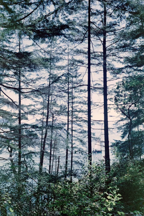
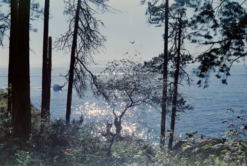
As you may have noticed, the images rendered by this film are not as accurate or true-to-life as something you’d expect from Kodak Portra 160 or Ektachrome E100. Nevertheless, I find the results — at least from the best few frames off each roll — undeniably warm and flattering. In some ways, Color’92 reminds me of the Polaroid SX-70 and Color 600 instant film.
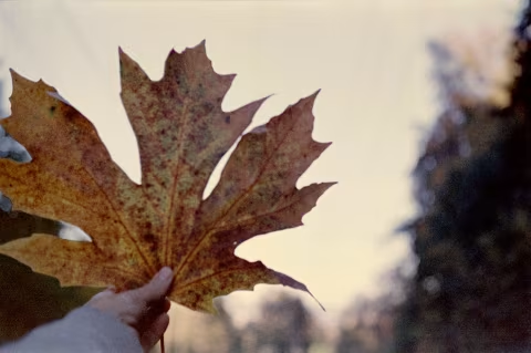
The delicate pastel undertones and blue hues create a beautiful unique mood, which can be charming in any situation really — we’ve seen wonderful results outdoors, at golden hour as well as in a studio setting. Red colors really pop and the rich grain gives it its nostalgic vibe.
— (All quote blocks in this article are Birgit’s responses to my questions about the film; some grammar and spelling edits are mine.)

Color’92’s advantage over Lomography’s earlier photochemical design (Metropolis) and ORWO’s new films is the muted/pastel pink hue that defines the skin tones whenever the result is properly colour-balanced (where the other films would have virtually no saturation or meaningful colour definition). You can see it in the sample portrait of my face here, and it stays true across a variety of skin tones (from light to very dark), which I’ve seen while researching this article.
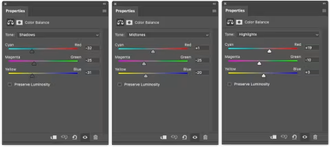
This rendered skin tone colour appears consistent across exposure zones, as long as the image is balanced to render middle greys and highlights as close to actual as possible. While you may certainly add more blue or green to your frames in post, the rest of your scene may get a colour cast that can’t be corrected unless you go back to the warm colour profile Color’92 tends to render naturally or edit colours selectively. Of course, your scans may not have this appearance immediately without some adjustments, but once you tweak them (most likely by bringing down the blues in the shadows and greens in the mid-tones), chances are that your entire scene’s palette will fall into place.
Color’92 shows the best colour separation and most flattering skin tones in the mid-tones when you introduce a considerable amount of red bias and cut some of the blue cast (I do this using the Color Balance adjustment layer in Adobe Photoshop after normalizing the histogram). Unfortunately, this also means that your shadows or under-exposed areas may show noticeable chunky red granules. And if you try to fight that, you may lose that pastel hue or even turn the skin green.
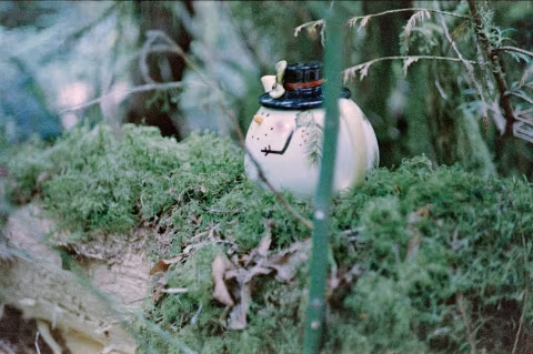
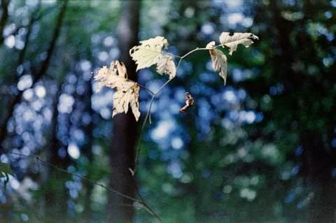
If you don’t have people in your photographs, there’s usually more that you can do to your scene’s colours. Most of my photos are taken on hikes; I found Color’92 to do well when there are lots of vivid colours in the frame with an overall moderate contrast. So something colourful under a shade is probably an ideal object to photograph with this film. The problem with high-contrast scenes is the above-mentioned red granules in the shadows and loss of saturation in the over-exposed areas (which is why the sky may appear yellow with this film unless you under-expose it or use a polarizing filter).
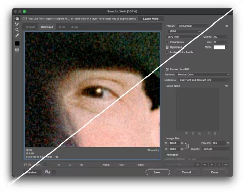
My last piece of advice for when you’re working with this film in Photoshop (and maybe other image editing software) is to use the “Convert to sRGB” function when exporting the image. I found that without this setting turned on; the composites would lose some saturation and become a little greener than I’d like them to.
Given the amount of nuance I described about this film, it may seem flawed or limited — and it is — but the results I got from it have nevertheless surprised me with how good they looked on display and in print.
Grain structure, sharpness, resolution, and dynamic range.
Lomochrome Color’92 is noticeably grainer than Ultramax, Portra 400, 400D and Superia X-Tra 400. It’s about as grainy as Lomochrome Metropolis and maybe a little smoother than ORWO NC500.
On 35mm, the grain is noticeable on all prints and screens if it’s in the shadows — much less in the highlights, where it appears to be packed tighter, and there’s less variation in colour between the granules.
The grain on Color’92 appears less harsh and more “organic” than on Metropolis and NC500. In other words, while the granules are about the same size, their shape and colouring blend into the image visuals a little more seamlessly.
Despite the chunkiness and its “organic” appearance, Color’92’s grain renders plenty of micro contrast (sharpness) that helps resolve a good amount of detail. There’s no need to sharpen your images after scanning, which some of you may find helpful.
As mentioned, the grain is more prominent in the shadows; however, this is where Color’92 also shows an improvement in its dynamic range of Metropolis and NC500. Whereas the other films would show no information in the particularly dark areas, ‘92 draws at least some details that may often appear tinted a shade of brown or green (depending on the colour balance you set on your film scan).
Exposing Lomochrome Color’92.
Color’92 is a medium-low contrast film with saturation appearing to decrease with every additional stop of light. Increasing the contrast (either by choosing a strongly lit scene or in post-production) can come at the cost of increased graininess. You can soften the grain’s effect by using larger apertures with narrower depths of field or simply shooting this film in medium format.
Softer light, low-contrast scenes work well with Color’92 — this combination can create “melancholic” and “nostalgic” looks, which I think this film does exceptionally well.
Color’92 works well with flash photography and can be used to take photos at night. It doesn’t seem to have issues with reciprocity failure at one-second exposures, though I didn’t push it any further during my tests. However, this is a daylight-balanced film, so watch out for mixed lighting (which can make colour correction difficult), consider shooting with a blue filter, and prepare to make some adjustments after scanning.
Even though this film appears to have a decent dynamic range, Color’92 has a sweet spot between zones IV-X (mids to highlights) where the grain recedes, colour casts are easier to control, and colour accuracy improves. I would aim to have as much of that as possible.
Developing and scanning Lomochrome Color’92 at home.
I developed my film at home in a freshly mixed batch of C-41 chemicals along with a roll of Portra 800 that came out looking normal. Color’92 negatives looked exceptionally dark and oddly blue from the tank (both the images and the edges). The emulsion did not become any lighter after drying. There were no edge markings, but I could tell which way is up for scanning by the direction the film curled.
The scanned images turned out comparable in contrast and fidelity to the samples Lomography distributed. I used PrimeFilm XAs to create digital negatives for this article, which I then inverted in Photoshop.
It's been 4 years since our last completely new Color Negative Film (the LomoChrome Metropolis), so this is an exciting milestone. Everyone is super excited and the community’s response on day 1 was incredible: The feedback was overwhelming and positive and we sold through our first batch we had in stock within a few hours! Naturally, everyone here as well as at HQ is over the moon.
Behind-the-scenes.
Birgit Buchart filled me in as much as she could on the mood in Lomography offices days after the launch. The company has been in business for over thirty years; they survived the digital revolution (when everyone switched to sensors from film), released the first new colour emulsion in over a decade (Metropolis), and launched a new film (almost) in time for their big three-o.
[Color’92] is a reference to the year Lomography started off — 1992. We’re still celebrating our 30th Anniversary; a new film stock is always a big milestone, plus the look of the film is so retro and it kind of reminded us of the aesthetic of the early 90s, so it all just made sense.
Of course, a project of this magnitude isn’t created in the vacuum of manufacturing floors and corporate offices. Lomography has an excellent rapport with its community of creative consumers whose works they feature prominently across the products, including this new film:
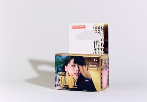
We’re incredibly lucky to have a wonderful, talented and supportive community of photographers who are always down to test our prototypes and first test rolls to create the first sample images, from which we have the very difficult task of picking which images go onto the film box. The [Color’92] box features images by Meay, Naphattanun Phetariyawong, and Rafael Hernandez-Ispache.
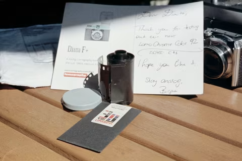
❤ By the way: Please consider making your Lomography Lomochrome Color’92 colour film purchase using this link so that this website may get a small percentage of that sale — at no extra charge for you — thanks!