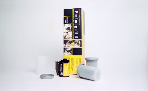
Kodak Pro Image 100 Film Review
A Versatile, Affordable Colour Film for Accurate Skin Tones and Creative Applications
13 min read by Dmitri.Published on . Updated on .
Kodak Pro Image 100 was sold exclusively in Asia and South America since 1997. Kodak had only begun distributing it in Europe in July 2018 and in North America in April 2019.
In 2021, it was almost cancelledcancelled¹ in the US — yet it survived and continues to thrive in late 2025 — and, hopefully, for many more years, as it’s been my favourite ISO 100 colour-negative film since I first tried it.
Sold in bulk boxes of five, this film is one of the most affordable 35mm colour-negative options on the market. But why is it named “Pro,” how good is it, really, and why did the West have to wait over 20 years to get it?
In this review, I’ll cover all the technical aspects of this emulsion, share plenty of samples, and explain how to make the best of Kodak Pro Image 100 — a film many photographers recognize as a viable alternative to the premium Portra series. But first: what’s with the wait?
In this review: Pro Image is made for warm climates. Pro Image has better colours than Kodacolor. Overexposing Pro Image 100 for an airy effect. How to get pastel tones with Pro Image and other colour-negative films. Pushing Pro Image 100 +2 stops to EI 400. Dynamic range and contrast. Grain structure, resolution, and sharpness. Scanning and post-processing. Price and availability. Support this blog & get premium features with GOLD memberships!¹ — See Kosmo Foto news article from August 2021.
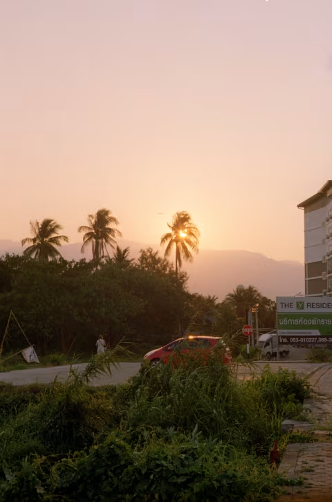
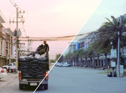
Pro Image is made for warm climates.
While the premium Portra series dominated Kodak’s lineup of “working” films in places where it snows, Pro Image was sold as the choice colour-negative stock for event photographers in warmer spots — but somehow not Australia.
At ISO 100, Pro Image is slower than all Portra films — the slowest being Kodak Portra 160. It’s also much grainier than Portra (PGI 43 vs. PGI 28 for Portra 160 — more on that later). Based on that, Kodak sold Pro Image for less.
Yet this film offers something no other colour-negative stock can: superior shelf stability in warm climates.
KODAK PROFESSIONAL PRO IMAGE 100 Color Negative Film is a medium speed (EI 100) film that features high color saturation, accurate color and pleasing skin-tone reproduction, and good underexposure latitude. It is intended for portrait and social applications, and can be stored at room temperature—even in hot, humid climates.
— Kodak Pro Image 100 manufacturer’s datasheet.
Pro Image is Kodak’s perfect marketing formula for markets with lower average incomes near the equator. Grainier, cheaper than Portra — lasts without a fridge. No medium or large format options — but, as you’ll see, better colours than those on Kodak’s “consumer” stocks such as ColorPlus made for casual photographers. Pro Image was a choice for professionals seeking to create high-quality images on a limited budget.
This film was Kodak’s distribution secret. No wonder — if the folks up north could get a viable Portra alternative with a bit more grain but similar colours and superior stability, they may’ve never dropped cash on the premium stocks.
At last, Kodak relaxed its grip on this unique stock for Europe and North America in July 2018 and April 2019, respectively — as well as in Australia around those dates.
Pro Image has better colours than Kodacolor.
Kodak has recently reinitiated its Kodacolor brand. Kodacolor 100 is one of the films under it; it’s on the cheap end of their colour-negative catalogue, which was rumoured to be the same as Pro Image.

However, my investigation revealed that these are not the same films. Aside from having different edge markings, Pro Image shows greater saturation and is easier to scan. As I pointed out in the above investigation, Koda makes several low-end films that we may not be aware of (e.g., stocks for whitelabelling and disposable cameras). My understanding is that Pro Image is not a part of that tier — it’s better. At least when it comes to colour reproduction and definitely for shelf stability, as no other film claims to retain its freshness in warm climates.
So, what are the Kodak Pro Image 100 colours like? And why do I call it my favourite ISO 100 colour-negative film?

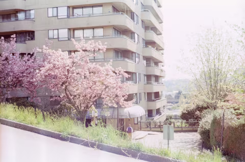
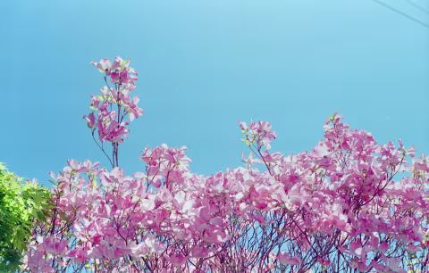
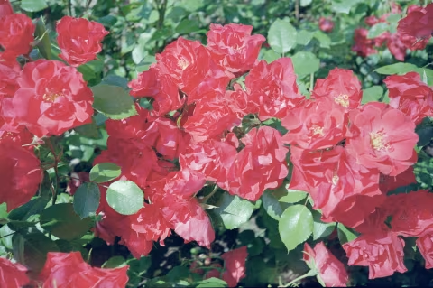
On a sunny day, when scanned properly (more on that later), Kodak Pro Image is well-saturated, medium-low-contrast, colour-accurate film. Without any contrast or saturation adjustments, straight out of my Nikon COOLSCAN (as well as other scanners), it shows strong yellow and red hues and works beautifully for portraits.
Warm daylight makes the images shot on this film simply outstanding. Even before I began developing and scanning my own film, various labs (which all delivered different results, most of the time with exaggerated contrast) still made it look great.
However, over the years of use, I’ve noticed that Pro Image truly works best on a sunny day. While it’s not impossible to make it work in overcast weather, being a medium-low contrast film, it becomes a little less legible than I’d like, and its fairly high saturation levels are no help. I found that this type of weather can yield images that require some colour correction, especially if you scan them using software that automatically inverts the negatives.
Having shot it under studio lights, even the ones with 95+ CRI (i.e., 95% accurate compared to natural daylight), Amaran F21x, I still had to make some slight adjustments. Of course, that’s not a big deal since most colour-negative film calls for some sort of colour correction after being scanned.
But not on a sunny day. Photos shot with Pro Image in clear weather look fantastic without any edits. In fact, this film, under these conditions, looks better straight out of a scanner than any of the Portra films.

⚠️ Avoid shooting Kodak Pro Image 100 in artificial light — it will create a strong green cast that’s nearly or completely impossible to correct after scanning.
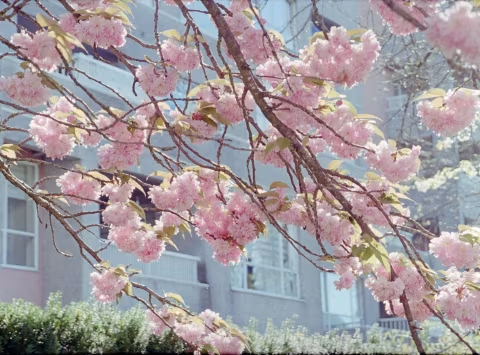
Overexposing Pro Image 100 for an airy effect.
Though Kodak Pro Image doesn’t have the extensive dynamic range of Portra films (more on that below), you can overexpose it if you’re careful.
Going too far will erase details from the highlights, but just before that point, you may get airy, dreamy colours like in the photos below. They were all overexposed by one stop (i.e., metered as an ISO 50 film), max 1.5 stops (~ISO 36-40).
The same “rule” applies to light selection: bright, sunny days are best. However, you may also need to do some colour correction after the fact (grayscale masking should do the trick).
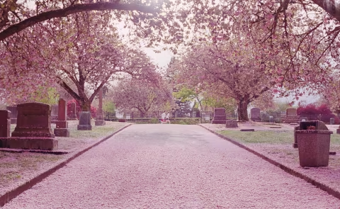

How to get pastel tones with Pro Image and other colour-negative films.
Pro Image 100 is a good candidate for slight overexposure, which is typically used with higher dynamic range films, such as Portra 800, to create pastel colour palettes.
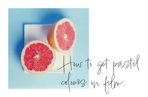
The film’s tendency to render warm tones gives it a slight edge over other emulsions when it comes to overexposure and colour manipulation, which increases blue values in shadows and highlights.
I used Pro Image extensively while researching methods for building pastel-themed environments and modifying scans to give them an airy, whimsical atmosphere that’s a hallmark of Wes Anderson films and certain minimalist photographic artists.
Learn how to get pastel colours on film with this in-depth guide.

Pushing Pro Image 100 +2 stops to EI 400.
You can push this film if you like more contrast or need it to be more light-sensitive (for example, if you need a high shutter speed for action shots).
I’ve pushed Pro Image 100 to ISO 400 (+2 stops); however, the film loses some of its colour accuracy when exposed and developed that way. In the best case scenario, the images will look exactly like they would with standard development; worst case, they will have a “cartoon-like” appearance with fewer shadow detail, strong saturation, yet medium contrast in the mids and highlights:

Dynamic range and contrast.
Pro Image 100 is a medium-contrast film — until it’s overexposed. The dip in contrast levers in highlights helps it retain detail when exposure mistakes were made or if you’re deliberately trying to add some “airiness” to your scenes.
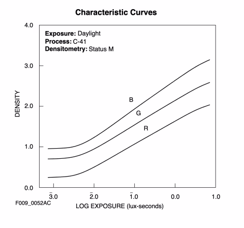
Kodak’s datasheet shows the film’s dynamic range curves, which indicate about 2.3 lux-seconds of useful exposure, translating to about 7.5 stops of dynamic range.
Compared to other films (e.g., HP5 — 12 stops, Ektar — 9 stops, Provia 100 F — 5 stops), Pro Image 100 shows a low-to-average ability to capture both shadows and highlights simultaneously. But in practice, I found that Pro Image 100 responds very well to over-exposure.
I describe my over-exposure results on Pro Image as airy, with a minimal but perceivable shift in colour accuracy. Given that adding a stop or a stop-and-a-half of light exposure may also help with the yellow cast, rating this film at ISO 50 or 80 may yield favourable results.
Pulling back the exposure digitally is fairly easy using the Curves layer or any tool of your choice.
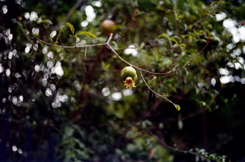
Grain structure, resolution, and sharpness.
Some films reviewed on this website use the RMS granularity index, which is a number that signifies how grainy the film is. Others, like Pro Image 100, use the Print Grain Index (PGI) that relies on surveys rather than direct measurements. The image below (a cropped screenshot of the datasheet) explains how PGI works:
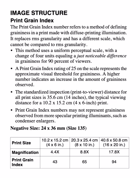
The three PGI numbers for Pro Image suggest that this film has noticeable grain on even the smallest print sizes (4x6”). However, I had trouble noticing any grain in my scans on small devices. The only time it became significantly apparent was with half-frame scans blown up on a large monitor.
According to the PGI measurements, the graininess of Pro Image 100 is almost identical to that of Kodak Gold. Still, it’s neither overbearing nor particularly visible when scanned on a high-resolution device. Moreover, if you look closely, the granules appear sharply defined, which can be advantageous if your lens or scan lacks microcontrast. But if you want less grain, consider Kodak Portra 160, which has grain nearlly half the size of that on Pro image (PGI 28 on a 4x6” print) or Kodak Ektar 100, which has PGI <25 (practically invisible grain).
Scanning and post-processing.
Pro Image 100 is relatively easy to digitize. It lies flat and has sharp grain that’s easy to focus on. If you’re happy with how the scanner software inverts the negatives — great! But as I mentioned above, there’s a chance of a colour cast in some cases, which you may want to deal with. I suggest greyscale masking as an easy technique to get your images looking natural.
Price and availability.
As of November 2025, Kodak Pro Image sells for about $50 for a pack of five or around $11 for a single roll.
It’s generally available worldwide and shouldn’t be difficult to find at a specialty photography store. You may even find it on places like Amazon — but keep the prices I mentioned above in mind, as general stores, if they have it, may inflate the price.
❤ By the way: Please consider making your Kodak Pro Image 100 film purchase using this link so that Analog.Cafe may get a small percentage of that sale — at no extra charge for you — thanks!