Kodak Kodacolor 100 Film Review
A New Kodak Film?
10 min read by Dmitri.Published on .
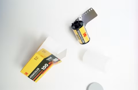
Kodak Kodacolor 100 is a medium-contrast, medium-saturation colour-negative film with packaging design reminiscent of the classic 1980s branding.
Kodacolor 100 was announced in early October 2025 as one of the “sub-brands of existing Kodak films,” offering “the same high quality you’ve come to expect from Kodak.”
In other words, Kodacolor 100 is not a new formulation — rather something that Kodak already makes but in a new box. But it’s neither Pro Image nor Ektar, and it’s not Aerocolor.
Kodacolor 100 is a worthy film that can deliver colour accuracy and grain size similar to those of Kodak Gold and Kodak ColorPlus. If you like these films, you may like Kodacolor.
In this review, I’ll briefly discuss the origins of this film and cover the basics, such as colours, grain, and price. I will also give a few tips on scanning, exposure, and daily use.
In this review: What is Kodak Kodacolor 100? Colours. Contrast & dynamic range. Grain, resolution, sharpness. Scanning. Exposure and editing tips. How much does this film cost? Where to buy. Support this blog & get premium features with GOLD memberships!
What is Kodak Kodacolor 100?
If you’re looking to learn which existing film is now branded as Kodacolor 100, I can’t answer that.
There is no doubt that this film is not Ektar: the grain is visibly larger, and the colours are undeniably different. It’s not Aerocolor as these films have different base colours. And it’s obviously not Ektachrome, as that’s a slide film that makes ready-to-view positives.
I don’t think it’s Kodak Pro Image 100 either — I’ve run side-by-side tests and found slight differences in saturation and colour rendering that can’t be attributed to development, exposure, or scanning methods. Everything was shot under controlled studio light, developed in the same film tank, and scanned using software I built for the purpose. I’ve even sent samples to several photographers and non-photographers to confirm the differences, however small they are.
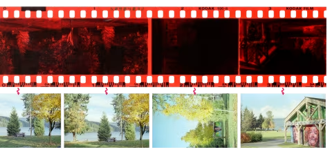
Kodacolor 100 may be similar to Lomography Color Negative ISO 100, but the edge markings on these films differ: Lomo prints 100-2, whereas Kodacolor prints 100-8. It’s still possible the formula is identical in these films, but I haven’t had the chance to test their colours against each other, as I did with Pro Image (should I? — let me know!).
I have, however, found examples of Kodak films with Kodacolor 100 edge markings (100-8) developed in 2009 and 2008 on Flickr. Alas, that finding alone doesn’t say much aside from the fact that this formula has been around for at least 17 years. Perhaps Kodacolor 100 has been quietly resurrected, or it simply may have been sold as something else in an unfamiliar market.
If you’ve shot Kodak film that says “100-8” on its edges before 2025 — please let me know, I’d love to know where you got it and what the box looked like!
It’s worth noting that scanning hardware and software, as well as darkroom choices, can drastically alter image colours. film Q helps maintain consistent colours due to its non-proprietary technology, which I combine with greyscale masking. Lab prints and most scanner inversion tools, on the other hand, can exaggerate or hide the differences between films like Kodacolor 100 and Pro Image 100.
Colours.
Kodacolor 100 colours use the classic warm Kodak palette with medium contrast and medium-high saturation.
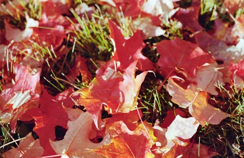
Note that Kodacolor 100 may not render deep oranges correctly — they will typically appear a brighter shade (closer to yellow) after scanning and inversion. This may be the key to the “golden,” warm colours that Kodak films typically create. For portraits, however, this can be a desirable effect as it “protects” skin tones from shifting towards reds, which could otherwise be considered unflattering.
Without looking at the charts and skin tones too closely, the colours can appear quite realistic, though some textures won’t be as accurate as with pricier films, like the Kodak Portra 160. Nevertheless, I think this film is perfectly suited for most jobs, particularly bright, sunlit outdoor scenes.
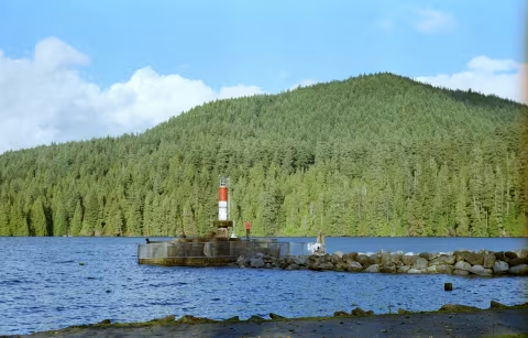

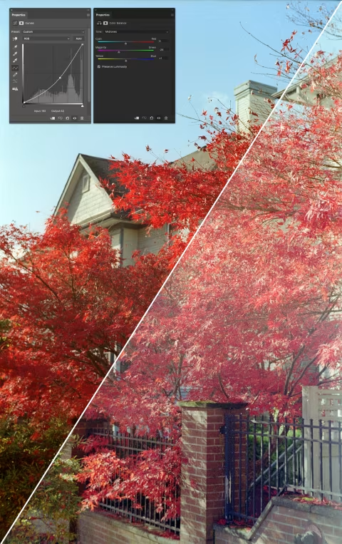
One place this film can struggle with, when it comes to colours, is the shadows with complex textures, like the walkway in the photo above. As you may notice, it’s a mix of highly saturated dark blue and green shades, which shouldn’t be the case, even for wet asphalt. Admittedly, this photo required a slight contrast increase after scanning, which naturally increased the saturation in the shadows.
Shadows with complex textures are usually difficult for most colour films to reproduce accurately. This is when slide films, like Kodak Ektachrome E100, could be useful as they store more information in the shadows and are designed with some of the best colour reproduction methodologies.
Contrast & dynamic range.
Kodacolor 100 is a medium-contrast film. Some of the photos above were adjusted to increase their contrast. I’ll show exactly how much contrast I’ve added to the photos and what you should expect from your scanner below. In general, a well-scanned Kodacolor frame should have enough flexibility to be both overexposed and edited to improve its quality.
Kodak does not publish technical data sheets for this film, though it’s probably fair to assume its dynamic range is comparable to that of Kodak Gold, which is eight stops. Kodacolor 100 feels like a film that can handle a similar range of dark and bright shades as Gold, with enough room for improvement via edits.
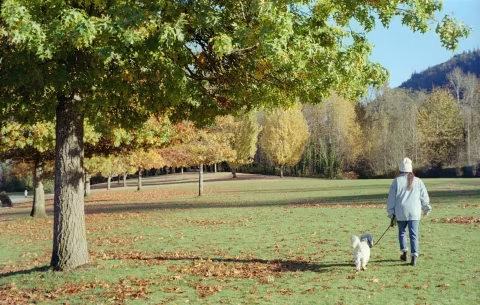
In short, Kodacolor 100 should be safe to shoot in a variety of daylit scenes — from bright, sunny days to forest shadows — and it should tolerate some exposure mistakes (which makes it an ideal tool for learning the Sunny 16 Rule).
But of course, spot-on exposures will make scanning easier and require fewer edits afterwards. As mentioned, this film can struggle to render complex textures in the shadows; thus, it may be worth overexposing the highlights to gain a little more shadow detail in high-contrast scenes (like the one below).

Grain, resolution, sharpness.
Despite costing less than Ektar, Ektachrome, and Portra films, Kodacolor 100 delivers sharp, fine-grained results with lots of detail — particularly when exposed in bright daylight and scanned with good hardware.
Being a colour-negative film, Kodacolor 100’s grain is fairly sharp (in contrast to the “cloudy” dots some slide films can produce). This makes it suitable for use with less-than-sharp lenses as it’ll add some microcontrast to the image. Of course, the visible film granules and the contrast they add aren’t necessarily part of the original scene, yet the texture can make your photos appear more detailed than the lens would otherwise render.
The nice thing about film photography today is that we are no longer in a race to hide all visible grain. While impeccable resolution is still attainable with pricier films, larger formats, and better scanners, enlarging frames from films like Kodacolor 100 until each granule is distinctly visible is not a real issue. In my room, I have several prints made from Kodak Aerochrome; the film is notoriously grainy, yet the images look rather nice and have fetched several compliments from visitors.
Scanning.
You can expect a wide range of results from this film, depending on how it’s scanned. Some labs and inversion software will apply presets that can make it completely different from what you see in this article, which is usually not a serious problem, as the overall colour profile should remain about the same. If you find that your colours shift towards red or green, for example, you can try greyscale masking to fix your scans.
A bigger issue with scans in general is clipped shadows and highlights, which can manifest as unnaturally high-contrast images. This can be caused by a low D-Max resolution of the scanner or an insufficient brightness of the backlight in the digital camera setup. Or it can be the result of the scan inversion software artificially adding that contrast based on internal, often hidden, presets; if that’s the case, you can try film Q to invert your negatives — this app does not apply any edits to your images other than inverting individual colour channels and stretching the histogram to fit the new colour space.
If you find that this or any other of your colour films lacks colours or shifts towards green while scanning with a digital camera, consider replacing your backlight with a higher-CRI-rated one.
The last impediment to a good scan can be the lens itself. The photos in this article were shot with a 70-year-old Voigtländer Vitessa A — a camera that, despite its sharp, highly regarded lens, can flare and lose some contrast in bright light.
But even with a perfect lens and a scanner, Kodacolor 100 may benefit from some colour balance and contrast adjustments, particularly if you choose to overexpose it slightly to improve shadow detail. That’s generally the case with most colour-negative films.
Exposure and editing tips.
In the presence of good light, it’s hard to go wrong with Kodacolor 100. It certainly performs better when overexposed and then adjusted for higher contrast in post (provided you have a good scan) than the other way around.
Kodacolor 100 offers decent flexibility for post-processing, although you aren’t necessarily required to do anything to your scans to make them look good.
How much does this film cost?
Kodak Kodacolor 100 is marketed and sold as an affordable, reliable colour-negative film option. Many shops sell it for less than $10 (as of December 2025). The prices outside the US may be slightly higher due to shipping, distribution, and export tariffs.
If you’re keen on understanding how much each film should cost as well as film photography’s general market trends, check out the Film Price Trends app.
Where to buy.
Please check your local shop or follow the links below to help support this blog with your purchase:
❤ Please consider making your Kodak Kodacolor 100 film purchase using this link so that this website may get a small percentage of that sale — at no extra charge for you — thanks!