Kodak ColorPlus vs. Kodacolor 200 vs. Kodak Gold
9 min read by Dmitri.Published on . Updated on .
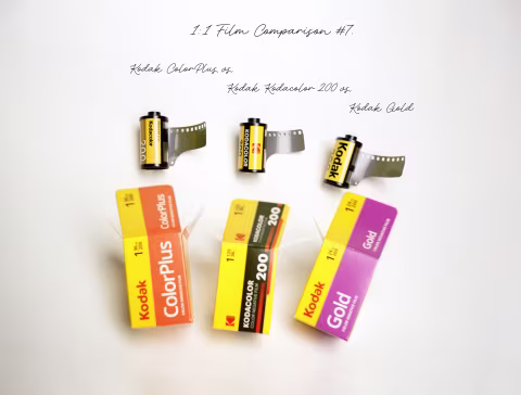
Kodak sells a lot of film. When the world asked them for more medium-speed colour-negative film, they answered with three products: Kodak ColorPlus, Kodak Gold, and now the new Kodacolor 200.
As you can see above, all the films use similar branding. You may also notice that Kodacolor 200 features a bolder typeface, vintage design inspiration, and a different Kodak logo. But that doesn’t tell us much. Besides, it’s what’s inside that matters.
Alas, the film cartridges reveal even less information than the packaging. Kodak ColorPlus prints “Kodacolor 200” on its side, same as the new film. And Kodak Gold film just says “Kodak 200.”
Seeing how Kodak is not doing a very good job at explaining the difference (if any) between those three films, I spent several days researching and planning an experiment that compares the colours, grain, and dynamic range under various lighting conditions.In this article: Why do we have three similar films from Kodak? Guess! Experiment overview and methods. Answer key. Side-by-side: exposure tests in the studio. Edge markings and base thickness. Side-by-side: outdoor light. Pick one that looks better and supports Kodak more directly. Support this blog & get premium features with GOLD memberships! ☝︎ Further reading: See my comparison of Kodak Kodacolor 100 vs. Kodak Pro Image 100.

Why do we have three similar films from Kodak?
In 2012, Kodak was split into two companies, following a bankruptcy proceeding. Eastman Kodak Company retained its factory and various divisions; Kodak Alaris became an exclusive distributor of Kodak film to photographers.
The red “Kodak” letters on the film boxes make the Kodak Alaris logo.
The stylized red “K” is the Eastman Kodak Company logo. And it is completely unexpected to be there.
Given that Alaris has the exclusive distribution rights, it’s unclear how Eastman Kodak managed to go around them and release its own film. Whatever the case may be, Kodacolor is just another way to get Kodak film with one less entity in between.
Kodacolor aside, an earlier experiment revealed that Kodak Gold and ColorPlus are not exactly identical. There are some small differences between the film bases and the colours they produce. My understanding is that their distribution had also previously diverged: ColorPlus is for the South American and Asian markets, whereas Gold is for the rest of the world (although that may have changed in recent years).
So what does that mean for us? Is it just a matter of availability and packaging, or is there an actual difference between those films once they’re shot, developed, and scanned?
Guess!
Some films are easy to recognize; Kodak Aerochrome is an extreme example, thanks to its vivid false-colour infrared palette. Film Ferrania P30 is the second-most-recognizable black-and-white film, according to these stats.
Do you think our three ISO 200 Kodak colour-negative films will be easy to tell apart? What do you think this image was shot on:

Answer below the fold.
Experiment overview and methods.
Most film photographers learn that processing and scanning can significantly alter the look of film before editing even begins. Failing to control these can render comparisons inconclusive or misleading.
For example, in an earlier experiment where Daren and I compared Kodak Gold and Kodak ColorPlus films (no Kodacolor), we developed both films in the same Paterson tank and scanned them twice: with a DSLR and then a dedicated film scanner. Daren inverted his DSLR scans in Negative Lab Pro. I used film Q, an app for inverting negatives without altering any of their characteristics.
What we found contrasts some of the top-ranking articles, videos, and now AI answers that assign a “vintage” look to ColorPlus and a “modern” look to Gold, without explaining the process or providing sufficient proof. Misleading assumptions can arise from simple things, like box design and marketing materials, price, presets that labs use to process film, and film inversion software profiles that often can’t be disabled.
I’ve done my best to counter biases and create a series of reproducible, reliable reference images in this experiment. Here’s how:
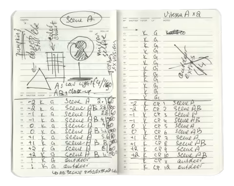
Experiment setup, tools, and process.
I’ve used a pair of Voigtländer Vitess A cameras with the same Ultron 2.0 lens. Since there are three films, I ensured that one of them, Kodak Gold, is 24 exp., leaving a 12-frame overlap where I’ll be shooting the same exact scene on three different films.
While using one camera with interchangeable film backs on a tripod may seem like a more robust solution, in reality, live subject, light, wind, and even the film’s position inside the camera can change from frame to frame, nullifying the effort and the limitation of a static setup. Thankfully, none of the above are significant enough factors to prevent accurate judgments.
I’ve set up a static studio-lit scene with a self-portrait attribute for the majority of this experiment. I planned to make several heavily bracketed exposures on each film and pick the best-representing images. Lastly, I took my cameras outside with two of the three films (I’ll explain why) to test them side by side in natural light.
Development. A freshly mixed set of the excellent Arista C-41 chemicals.
Scanning. I’ve scanned all film as digital negatives using Nikon SUPER COOLSCAN 500ED via VueScan.
Inversion. I used film Q, an app for inverting negatives without altering any of their characteristics. The app uses histogram stretching. The last step involved manual white balance adjustments with reference greyscale masks.
I hope this work will help you understand the true differences between ColorPlus 200, Kodacolor 200, and Gold 200 and give you deeper insight into these products’ origins and purpose.
Answer key.
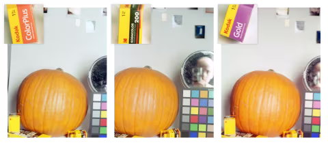
If you’ve guessed Kodacolor 200, you are correct.
As you can see, the three films are very difficult to distinguish. The only detail that stands out to me is that the pumpkin on the right (Kodak Gold) is slightly more saturated than the other two.
Let’s take a closer look.
Side-by-side: exposure tests in the studio.
Another angle, with a bit of my underexposed mug peeking out. Here, the pumpkin on the right appears a little lighter, while ColorPlus and Kodacolor 200 appear remarkably similar.
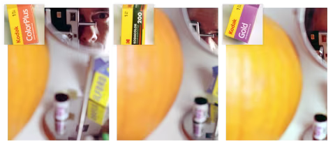
Severe underexposure causes colour shifts and distortions that could reveal a little more about our films. Below are the same films shot as if they were ISO 800 films without any compensation during development:
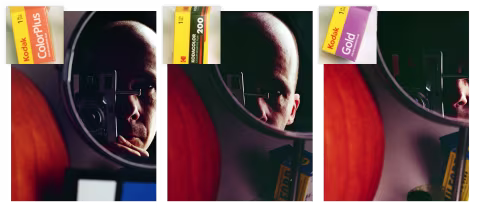
Spot any difference? Maybe the pumpkin, again?
Edge markings and base thickness.
Although I wasn’t paying much attention to film thickness while loading the cameras, Kodak Gold immediately felt firmer than Kodacolor 200 and ColorPlus once I started loading the strips in the dark.
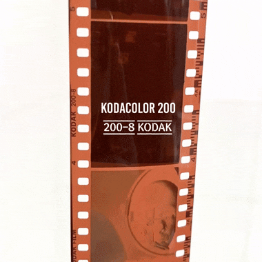
But the revelation came once I pulled the film out of the chemicals:
The edge markings are identical on Kodacolor 200 and ColorPlus.
Indeed, ColorPlus, which comes in a canister labelled “Kodacolor 200,” is indisputably the same film as the new Kodacolor 200. Who could’ve known. Still, I didn’t want to make this assumption as it could’ve easily been wrong — corporate nomenclature is notoriously inconsistent.
Side-by-side: outdoor light.
Now that we know that Kodacolor 200 and ColorPlus are the same film, let’s have a look at some outdoor one-to-one shots to get an idea of how much of a practical difference there is between Kodacolor 200/ColorPlus and Gold in the natural light.


Turns out that outside the controlled studio lighting with strategically placed objects or close-ups of skin tones, there is virtually no practical difference between Kodacolor 200/ColorPlus and Gold.
Pick one that looks better and supports Kodak more directly.
Seeing how ColorPlus and Kodacolor 200 are quite literally the same film, and Gold’s distinction from the other two is so slight, it needs lab-like settings to spot, picking a favourite can be both easy and an exercise in futility.
Of course, price may be a deciding factor, or you may prefer a specific design (I like the Kodacolor branding). But a deeper reason to choose Kodacolor over the other two films is to support a more direct relationship with the factory that makes the film.
Though not having Alaris between us and the Kodak factory will not necessarily make the film cheaper, as it would traverse numerous warehouses and distribution centres, it is still a choice we can make.