Kodak Gold vs. ColorPlus

Side-by-Side Comparison

13 min read by Dmitri, with image(s) by Daren.
Published on . Updated on .

In this article: Unconvincing comparisons and Kodak’s cryptic response. My first attempt at comparing Kodak Gold vs. ColorPlus. Refining test equipment and methods. Kodak Gold vs. ColorPlus: grain. Kodak Gold vs. ColorPlus: colours. Kodak Gold vs. ColorPlus: dynamic range and reciprocity failure. Kodak Gold vs. ColorPlus: differences between the physical negatives. Which film is better, Kodak Gold or ColorPlus? Support this blog & get premium features with GOLD memberships!

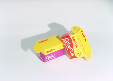
Kodak Gold and Kodak ColorPlus differ in pricing, availability, and box design. But given that they are both “budget” ISO 200 emulsions in Kodak’s line-up of films, I struggled to understand what the differences are when it comes to the results.

To figure this out once and for all, I teamed up with Daren from LearnFilm.Photography. We performed a series of real-world tests in his Hasselblad 500CM to control for lens, perspective, and exposure inconsistencies seen in others’ comparisons.

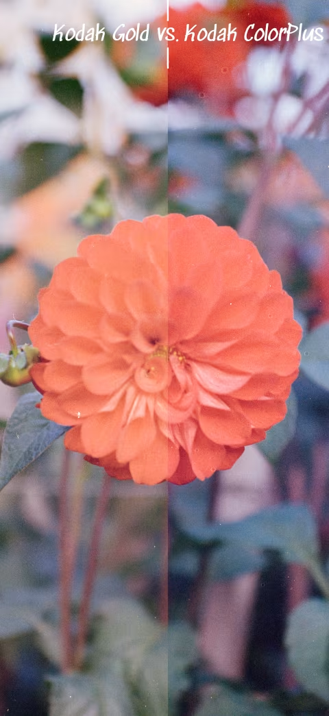
Turns out, Gold and ColorPlus’ grain looks identical at 10K DPI, and so do many other properties. There are slight changes in how those films render colours — though they aren’t nearly as clear as the Kodak marketing or the internet lore would suggest.

Below, I break down the results of our experiments and share some practical advice for those stuck deciding between the two films — or any two films.

Watch Daren’s YouTube video comparing those films here or below.

Kodak Gold (left) vs. Kodak ColorPlus (right) photographed on the same stationary Hasselblad 500CM with Hasselblad 120mm f/4 Makro-Planar CF T*. Both films were processed in the same tank and scanned on PrimeFilm XAs with automatic colour correction disabled (inverted by hand using the histogram stretching method).

Unconvincing comparisons and Kodak’s cryptic response.

I’ve shot and reviewed both films on this blog (see Kodak Gold review and Kodak ColorPlus review) and studied multiple sources online comparing those films. I’ve even contacted Kodak about this, yet I received no satisfactory answer. Their widely-quoted explanation of the difference between the films in the EMULSIVE interview provides no clarity either.

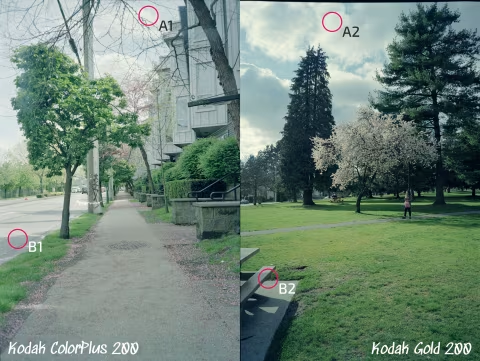
The online comparisons I reviewed had unconvincing side-by-side images shot at different times, probably different cameras, and unknown scanning methods. They all suggested ColorPlus to be an older, grainer emulsion technology but failed to provide sources or visual proof.

Wikipedia lists ColorPlus and Kodacolor 200 brands as the same film, whereas Kodakcolor is described on its dedicated Wiki as an old trademark for the modern Kodak Gold 200 emulsion.

I asked Kodak on Twitter back in June 2023 if they could name the differences, and they said: “ColorPlus 200 was introduced years ago as a lower cost offering intended for price sensitive markets. Customers tell us it has a more vintage feel.”

I was happy to hear back, but I didn’t find Kodak’s response satisfactory.

My first attempt at comparing Kodak Gold vs. ColorPlus.

I had my first opportunity to compare the films when I wrote the ColorPlus review. What I found surprised me a great deal: I could barely see any difference between them.

This felt contrary to everything I’ve read and seen online. Could the scanning software have something to do with the difference in the looks? Could the opinions of the people describing the differences between those films have been swayed by marketing or just unproven internet film lore?

Both of the samples in my first comparison attempt were scanned at home on PrimeFilm XAs with neutral settings into digital negatives and then inverted by hand; I was pretty confident that the scanning software had no relative effect on the final result.

Kodak ColorPlus looked near-identical to Kodak Gold during the initial round of testing. I point to some inconclusive differences in regions A & B.

Yet I could not reliably attribute the difference in colours I saw in the images to the emulsion: my samples were not perfectly matched. Many were shot at different times, in varying weather, of distinct subjects/scenes. They sort of matched, but not really.

Even more disappointing was the fact that I could not rely on official technical documentation to point me in the right direction. Kodak and Fujifilm are very good at publishing their film datasheets, which reveal a lot of scientific information that can be used to compare films. Unfortunately, ColorPlus turned out to be the first Kodak film I could not find a datasheet for.

I had no definitive answer.

Refining test equipment and methods.

Despite Kodak’s incomplete response/documentation and others’ ill-designed comparison attempts aside, I felt close to finally getting an answer.

Gold and ColorPlus are easy films to find. Better yet, I knew how to design a better test — by introducing strict subject, light, and lens control in addition to the existing scanning & image processing controls.

Daren, who owns a Hasselblad 500CM (text linkes to his review of this camera), a tripod, and a digital camera scanning rig with a Negative Lab Pro subscription, agreed to attempt an improved comparison with me.

Here’s how we designed it:

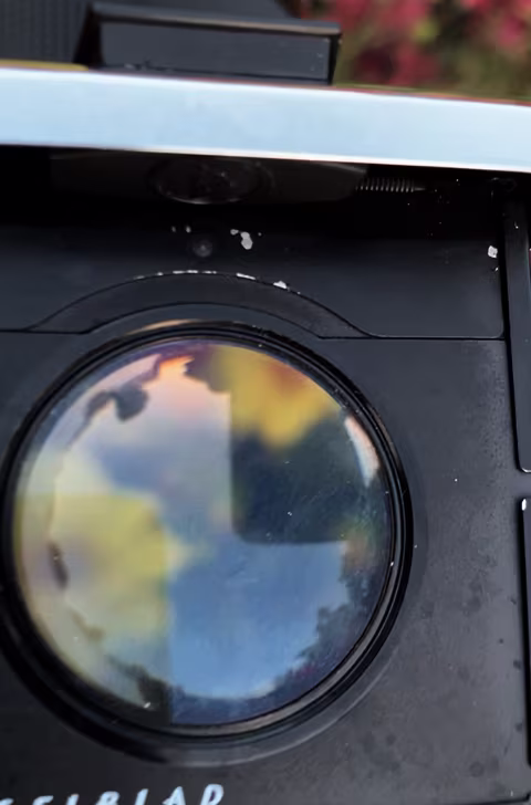
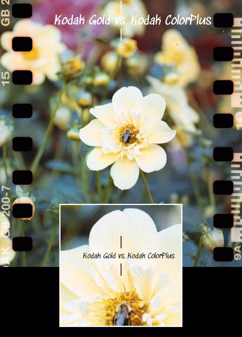
Hasselblad 500CM is a medium format camera with interchangeable backs (similar to Mamiya RZ67). We used this feature to keep the camera fixed on a tripod as we swapped the film backs preloaded with either Gold or ColorPlus. This way, we controlled for variations in the camera optics, scene, and perspective.

We selected flowers, a human subject (me), and a night scene in hopes of pushing the film to reveal any differences in colour rendering, dynamic range, and grain.

Both Gold and ColorPlus films were bought “fresh” (with a few months’ difference in expiration dates). Both films were tested in the 35mm format as ColorPlus is unavailable in 120. We used adapters to mount the film into the Hasselblad backs, which exposed the film as a series of 12 vertical panoramas.

Daren developed both rolls together in the same tank at home. This way, we controlled for any variation in chemicals, temperature, and agitation methods during processing.

We used two colour-negative film digitization methods: 1) a digital camera scan with Sony a7III with the 70mm F2.8 DG Macro Art lens following a proprietary conversion with Negative Lab Pro, and 2) a 198-megapixel composite scan on PrimeFilm XAs, inverted using well-documented stretching technique with no automatic colour correction, which controls for the opaque negative interpretation algorithms which could be secretly skewing the otherwise well-controlled nature of the experiment.

Kodak Gold (left) vs. Kodak ColorPlus (right) photographed on the same stationary Hasselblad 500CM with Hasselblad 120mm f/4 Makro-Planar CF T*. Both films were processed in the same tank and scanned via Sony a7III, inverted with Negative Lab Pro.

Kodak Gold vs. ColorPlus: grain.

Neither Daren nor I have an electron microscope. Our scanning methods are no different than those of most film photographers who invested in quality home-scanning setups.

I admit I expected to see a clear difference between the films since that’s what the internet is saying: “Grain is ever so slightly more noticeable than Gold.” — Agulliver on Photrio, “Kodak Colorplus has a bit of a more harsh and noticeable grain.” — Max Kent, “Colourplus is a bit grainier and generally more saturated colour. It’s very 80s looking.” — BeardySi on Reddit.

But alas, none of our scans showed any significant difference in the grain.

Note: Everything in this article is my evidence-based opinion. The most up-to-date scientific approach to perceptual grain measurement, developed by Kodak, is the Print Grain Index, which requires collecting a survey from a group of participants looking at printouts of various sizes. Still, our grain estimation methods are significantly more methodical than those offered by anyone else.

To double-check these findings, I’ve created a few scans of the films using PrimFilm XAs’ maximum interpolated resolution of 10,000 DPI, which produced a 6.7GB image file. Below is a blow-up of a neutral region on both films from that scan. Can you see any difference?

4x crop: Kodak Gold (left) vs. Kodak ColorPlus (right) photographed on the same stationary Hasselblad 500CM with Hasselblad 120mm f/4 Makro-Planar CF T*. Both films were processed in the same tank and scanned on PrimeFilm XAs at 10,000 DPI with automatic colour correction disabled (inverted by hand using the histogram stretching method).

Kodak Gold vs. ColorPlus: colours.

I did notice some differences in how each film renders colours. However, they are minute and probably inconsequential for most photographers.

Those differences were so slight that neither Daren nor I could confidently rule out the storage and production dates as the cause for their manifestation. Furthermore, I can’t discount the fact that, as a human being, I am compelled to seek out data that conforms to the common understanding that Gold is a superior emulsion (i.e., unconsciously fudging the results to make them match the expectations). Nevertheless, here’s what I found:

While there were virtually no discernable differences between Gold and ColorPlus in the scans that Daren produced with his Sony a7III, I was able to spot some minute changes on my high-res PrimeFilm XAs scans with complete control over colour.

The problem with tools like Negative Lab Pro (or any scanning software for that matter) is that they will interpret the colour using proprietary algorithms, which are often so complex and dependent on the input data that they cannot reproduce colours consistently. For example, if you crop the image slightly or introduce a spec of dust, the software may change the colours of your inverted image significantly.

And I’m not even including the fact that alteration of the near-infinite setting options or profiles in such software can further muddy the results.

To counter the above, I used a zeroed-out VueScan profile to get a non-inverted image with consistent exposure, gain, and colour settings that can not change between the scans. I then used a simple inversion method that uses a well-documented histogram stretching technique (i.e., no “secret sauce” and consistent results between scans).

The first photo that revealed some colour differences between those films was of the red flower (seen near the top of this article). It appears that ColorPlus may be rendering reds more vividly. But it was unconvincing because slight adjustments to colour balance could easily make both the Gold and ColorPlus halves of the picture look identical.

A much better illustration of the difference between the films was in the portrait of me Daren took: here, ColorPlus shows slightly less colour variation in the skin tones than Gold. This yields less saturated lip colour when the rest of the image is colour-balanced for middle grey.

Kodak Gold (left) vs. Kodak ColorPlus (right) may show slight differences in skin tonality when balanced for middle grey.

The above example implies that Kodak Gold may be a little better at registering fine detail in skin colour variation than ColorPlus, regardless of how it’s processed after the fact.

That is, if you try to add saturation to your ColorPlus scan, it’ll change the colours of the entire image and not necessarily add distinction between the neck skin tones and the lips. Doing so may also make grey tones appear less realistic.

Even though we have exceptionally powerful image editing software at our fingertips today, changing colours will not alter the number of shades and nuances the film can capture any more than we could convert black-and-white or 8-bit images to full colour. Sure, there are ways to do that with AI, but at that point, we’re “drawing in” the details an original image does not possess.

Film spectral sensitivity curves for Kodak Gold 200 via Kodak Alaris.

As Daren points out in his video, the emulsion properties responsible for detecting colours from the scene are described by the spectral sensitivity curves. If a film can detect more shades in skin tones, this graph may reveal the fact.

Again, spectral sensitivity only describes film’s ability to capture light, not how that data is interpreted in the emulsion layers or the scans.

Another way to think of this is to consider colour infrared film, which can capture a part of the electromagnetic spectrum we can not see, and no typical colour film can detect either. While we are free to edit typical colour photos and infrared photos to look as we please, no amount of editing can reveal infrared light in an emulsion that isn’t sensitive to it.

But, as I said earlier, there is no spectral sensitivity graph for Kodak ColorPlus; thus, I can not verify the differences I saw between the two films based on lab data. It’s not inconceivable that my roll of ColorPlus lost some of its sensitivity due to how it was stored or that there were other issues while scanning the photos.

Kodak Gold (left) vs. Kodak ColorPlus (right) photographed on the same stationary Hasselblad 500CM with Zeiss Sonnar 250mm f/5.6. Both films were processed in the same tank and scanned via Sony a7III, inverted with Negative Lab Pro.

Kodak Gold vs. ColorPlus: dynamic range and reciprocity failure.

Our last test was made at night when Daren and I tried to find changes in reciprocity failure and dynamic range as we pushed those consumer films to their limit.

I continued to see some slight differences in how those images rendered colours. However, my scanner had a lot of trouble with those exposures, so I deferred to Daren’s Sony a7III scans processed with Negative Lab Pro.

Reciprocity failure is a property of film that causes a decrease in sensitivity at exposures longer than one second. Many emulsions will need a lot more light than what your light meter tells them after that point; however, some films, like Fujifilm Neopan Acros II, will continue to stay accurate for up to 1000 seconds of an open shutter with just ½ stop adjustment (16min 40sec).

On that account, the two films had no significant differences in grain, highlight, or shadow detail.

Kodak Gold (left, marked with KODAK GB 200-7) vs. Kodak ColorPlus (right, marked with KODAK 200-8).

Kodak Gold vs. ColorPlus: differences between the physical negatives.

One last thing left to examine was the difference between the physical, developed negatives. Again, there was none other than the markings in the margins: Kodak Gold had KODAK GB 200-7 vs. Kodak ColorPlus’ KODAK 200-8.

As far as I can tell, both emulsions had the same thickness and base colour. Both films dried relatively flat.

Which film is better, Kodak Gold or ColorPlus?

If the minute differences in the colour I noticed are significant enough for you and you can reproduce them, Kodak Gold may suit your portrait photography better. From what I’ve seen, it’s conceivable that it can render a shade or two more in skin tones, which could mean a little more red in the lips.

Keeping in mind the fact that the colour differences are very slight (and likely negligible or non-existent in most cases), Kodak ColorPlus may be a better choice for landscape photography. This would be my preference, based on how it renders the colour red.

However, “the look” of your film may not even be the most important deciding factor when choosing between any two emulsions. In an article I published earlier about picking black-and-white films, there was much more to the practicalities of development, price, and film speeds.

Both Gold and ColorPlus are ISO 200 films that use standard development times in C-41 chemicals. Thus, the remaining differences between them are format availability (35mm for both and 120 just for Gold) and pricing (which will depend on your store and location).

And if you’re still undecided, have a look at Daren’s video, where he compares these films and draws his own conclusions. I am also posting it in the comments below for your convenience.

By the way: Please consider making your Kodak ColorPlus 200 and Kodak Gold 200 purchases using the above links so that this website may get a small percentage of that sale — at no extra charge for you — thanks!