Lucky C200 (乐凯) vs. Kodak Gold
Direct & Practical Comparisons With Colour Charts, Exposure Tests, and More
14 min read by Dmitri.Published on .
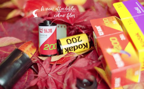
Lucky C200 (乐凯 C200, p.: Lè Kǎi) is a new colour-negative film manufactured in Baoding, Hebei (China). The technology behind it may or may not be stemming from Kodak’s short-lived collaboration with Lucky in the early 2000s — but as you’ll soon see, it looks very different from anything else on the market today.
In China, Lucky C200 is the cheapest colour-negative film money can buy. It has an MSP of ¥52 ($7.33), with buyers reporting having paid ¥65 ($9.15) for film, development, and scanning. This is significantly cheaper than importing Kodak films into China. But of course, depending on where you are in the world, there will be import fees for C200, with the US customers recalling having paid $10 just for the rolls. That’s how much I spent to get it in Canada ($14 CAD).
In most cases, it’s clearly an affordable film. But is it worth a try?
This article will examine Lucky C200’s colours, grain, contrast, and saturation — as well as physical properties against one of Kodak’s best-known affordable-tier films: Kodak Gold.
By the time you finish reading this, you should have a clear idea of whether Lucky C200 is right for your project and whether it’s a good substitute for the go-to “consumer” films offered by Kodak.
In this article: Experiment overview and methods. Lucky C200 vs. Kodak Gold: side-by-side under studio light. Overexposure tests: +1 and +2 stops under studio light. Underexposure tests: -1 and -2 stops under studio light. Grain size. Physical qualities: cartridge design, film base, and unusual emulsion colours out of the development tank. Which film is better? Support this blog & get premium features with GOLD memberships!
☝︎ We are so lucky to have this many colour-negative films to choose from this year! Not long ago, there was a shortage of anything film-related, with photographers reporting empty shelves wherever they looked. So far, Lucky is the ~6th unique ISO 200 option in addition to Phoenix, Gold, Kodacolor/ColorPlus, Fujifilm 200 (?), ORWO NC 200 (a.k.a., KONO Color 200/OptiColour 200).

Experiment overview and methods.
Lucky C200 and Kodak Gold are unmistakably different. Yet these films are a lot more alike than, say, Harman Phoenix 200 or ORWO NC 200 — the two new colour-negative films from the UK and Germany. C200 and Gold feature finer grain than the European varieties and slightly more nuanced, realistic skin tones.
☝︎ Further reading: “Comparing Phoenix vs. NC200.”
☝︎ Further reading: ”Kodak ColorPlus vs. Kodacolor 200 vs. Kodak Gold.”

The differences between C200 and Gold should persist across various development and scanning methods, but to identify them, it’s best to examine those films in controlled settings. In doing so, we’ll better learn the strengths and weaknesses of both films as well as what to reasonably expect from each at just under ten bucks a roll.
Here’s how I’ve set up the experiment:
Scene. A static indoor scene with a reference card, a portrait attribute, and various props.
Light. Amaran F21x 5500K with diffusion.
Exposure. Nikon FE with Nikon AI-S Nikkor 50mm 1:1.8 for Lucky C200 and Nikon F2 (same lens) for Kodak Gold. 𝒇4 1/125 (metered for middle grey) plus underexposure (-1, -2) and overexposure (+1, +2) brackets.
Development. Arista C-41 chemicals, same tank for both films.
Scanning. I’ve scanned all film as digital negatives using Nikon SUPER COOLSCAN 500ED via VueScan.
Inversion. I used film Q (an app for inverting negatives without altering their characteristics). Manual white balance adjustments with reference greyscale masks for artificially-lit scenes.

Lucky C200 vs. Kodak Gold: side-by-side under studio light.
Outdoor light can change rapidly. Often, we aren’t even aware that it has, which is part of the reason the Sunny 16 (a method for “seeing” light without a meter) is a skill we have to learn. A light breeze can shift the scene, affecting not only the position of its components but also the colours and contrast as the angle of reflection changes.
A consistent light set at a constant angle, carefully curated scene elements, and a tightly-controlled camera lens, position, and exposure are the same tools that film manufacturers use to test their emulsions.
I’m also adding an element you typically won’t see in those test setups — a self-portrait. In part, it’s to make the scene a little more interesting (or so I hope), and to add a bit more live context. Mannequin heads may be enough to demonstrate light-to-shade transitions, but they won’t capture the texture of human physiology, which comprises many hues influenced by skin tones, veins, bone structures, and more.
The colour chart in the scene, unlike the portrait element, is a well-calibrated set of Spyder Checker 24 swatches by Datacolor, printed on matte material to disperse reflected light as evenly as possible (for maximum consistency regardless of light position). I’m using it as a reference to compare how the Lucky and Kodak films render the colours relatively to each other.

I use the Datacolor chart to balance the scanned results using the greyscale masking method. This is the final step of film inversion, without which C200 may appear cyan, and Gold may look slightly green.
Below is the result of an exposure at 𝒇4 1/125 (metered for middle grey at box speed of ISO 200) after developing in the same tank and chemicals, inverting with film Q, and balancing the colours:
