Commuterland
Magazine Review
2 min read by Dmitri.Published on .
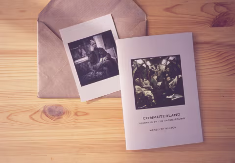
The images Meredith published in her fantastic little magazine aren’t shot on a film camera. They are digital creations, sneaked from a train onto paper.
The zine is dedicated to Keith, whom Merideth must care plenty about as the amount of attention to detail in this publication is remarkable.
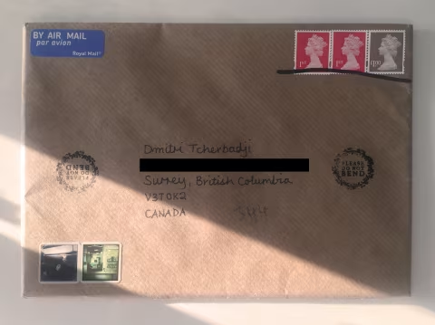
The envelope it came in is stamped with three UK postages: a delight in itself. Most of the mail nowadays is paid for via barcodes and pre-printed labels. Here, the address is written neatly with a black pen.
Two frilled PLEASE DO NOT BEND stamps and two of Meredith’s own “postage stamp” stickers complete the package. I’m willing to bet that the delivery workers took extra care handling this mail as to respect the author’s efforts. I call this a “zero-waste packaging,” as no person in their right mind should be tossing this brown paper sleeve.
I love the choice of paper for the magazine, which is a light-grey graphic material that has a cardboard-like texture and matching weight. It adds to the “analogue” feel of the package.
The Commuterland pages are lined with photographs of the passengers in their zone, sometimes up-close and personal, other times blending with their subterranean environment. Some scenes appear as if they are stills from a movie — peculiar and enchanting, not what one would typically expect from a train ride.
The design, including typography, paper choice, image editing, and binding is quite impressive. It’s great to see what we are capable of accomplishing on our own, given will and time.